 meh.dev
Vertical alignment in CSS can be difficult, one of the strategies for doing this is to use vertical-align which allows vertical alignment with an inline or table-cell box.
This can be used with media queries to create a responsive layout which switches between a horizontal and vertical layout depending on the size of the page.
A responsive layout like this is nice for mobile devices because it’ll rearrange between portrait and landscape mode, additionally it adjusts nicely when resizing windows on desktop.
Demo
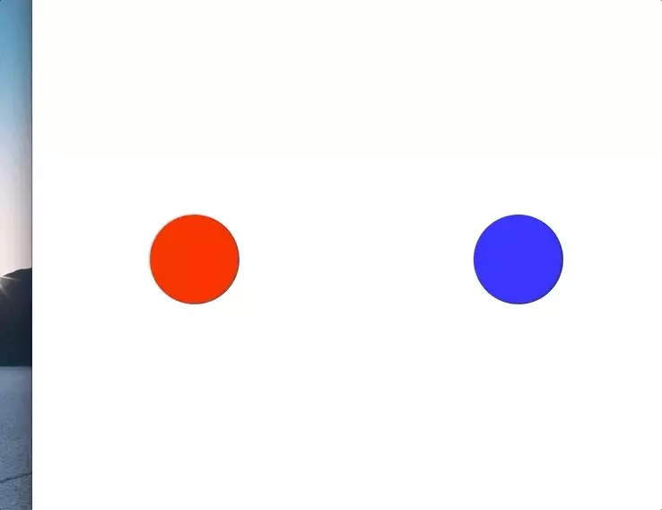
Horizontal Layout
A horizontal layout is pretty easy with tables, we just create a div styled as a table
.table {
    display: table;
    table-layout:fixed;
    width: 100%;
    height: 100%;
}
add a row
.row {
    display: table-row;
}
and add a few cells to the row using vertical-align to center our content in each cell
.cell {
    display: table-cell;
    vertical-align: middle;
    text-align: center;
    overflow: hidden;
}
Changing to a vertical layout
To change from a row with cells to a single column with rows we just need to do a basic pivot. In CSS we’ll change our row into a sub-table, each cell into a new row, and a new object for the new cells.
- table > row > cells
- table > table > rows > cells
Full Code Sample
<html>
<head>
    <style type="text/css">
        html, body {
            height: 100%;
            margin: 0;
        }
        .container {
            display: table;
            table-layout:fixed;
            width: 100%;
            height: 100%;
        }
        .pivot {
            display: table-row;
        }
        .column-child {
            display: table-cell;
            vertical-align: middle;
            text-align: center;
            overflow: hidden;
        }
        @media (max-width: 500px) {
            .pivot {
                display: table;
                table-layout: fixed;
                width: 100%;
                height: 100%;
            }
            .column-child {
                display: table-row;
            }
            .row-child {
                display: table-cell;
                vertical-align: middle;
                text-align: center;
                overflow: hidden;
            }
        }
        .circle {
            height: 100px;
            width: 100px;
            margin: 0 auto;
            border-radius: 50%;
        }
    </style>
</head>
<body>
    <div class="container">
        <div class="pivot">
            <div class="column-child">
                <div class="row-child">
                    <div class="circle" style="background: red;"></div>
                </div>
            </div>
            <div class="column-child">
                <div class="row-child">
                    <div class="circle" style="background: blue;"></div>
                </div>
            </div>
        </div>
    </div>
</body>
</html>